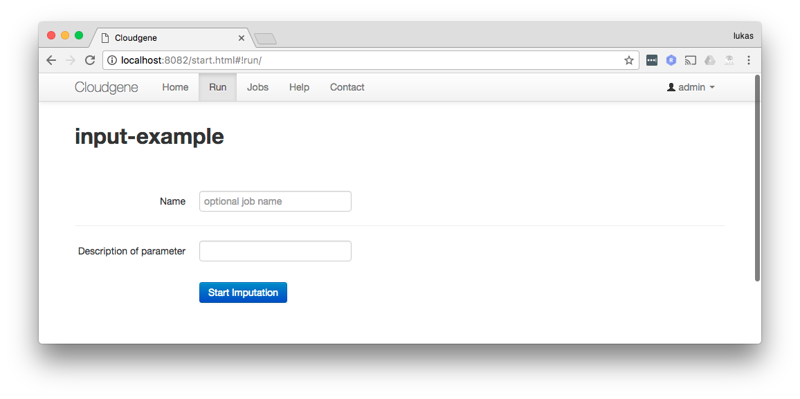
Inputs
Input parameters define which files or information the end user must provide. For example, if you have a workflow that analyzes a CSV file, you can define an input parameter to ask the user to upload their data file.
Cloudgene supports files, folders and basic input fields for numbers or strings. The Cloudgene web interface is dynamically created based on these input parameters.
Input parameters are defined in the inputs section, where each parameter is identified by a unique id, a textual description, and a type.
id: input-example
name: Input Example
version: 1.0
workflow:
  inputs:
    - id: param1
      description: Description of parameter 1
      type: number
    - id: param2
      description: Description of parameter 2
      type: text
The value of the parameter can be referenced by $id in the workflow.
id: input-example
name: Input Example
version: 1.0
workflow:
  steps:
    - name: Name Step1
      cmd: /bin/echo Value of Parameter 1 $param1
      stdout: true
  inputs:
    - id: param1
      description: Description of parameter
      type: number

Properties
These properties define the basic behavior of an input parameter:
| Property | Required | Description |
|---|---|---|
id |
yes | Defines an id for the parameter. |
description |
yes | This text serves as a label for the input field. |
type |
yes | One of the following types. |
value |
no | Defines the default value of this parameter. This value is preselected in the job submission form (default: empty). |
visible |
no | Defines if the input control is visible or hidden (default: true). |
required |
no | Defines if the parameter is mandatory or can be submitted empty by the user (default: true). |
details |
no | Provides more details about the parameter (default: empty). |
help |
no | Contains the link to a help page for this parameter (default: empty). If a link is provided, an icon appears near the label:  |
- Add serialize
- Add writeToFile
Checkbox
Creates a checkbox with two different states. The values property contains values that are used if the checkbox is either selected (true) or unselected (false).
- id: checkbox
  description: Input Checkbox
  type: checkbox
  value: false
  values:
    true: valueTrue
    false: valueFalse

File
Creates a file-upload field where one file can be selected and uploaded.
- The uploaded file will be copied into the local workspace.
- Contains the absolute path to the uploaded file.
- All input files will be deleted after the job run.
Folder
Creates a file-upload field where multiple files can be selected and uploaded.
- The uploaded files will be copied into the local workspace.
- Contains the absolute path to the folder that contains all uploaded files.
- All input files will be deleted after the job run.
Filetypes
The accept attribute specifies the types of files that the server accepts. By default, all files can be selected and uploaded.
To specify more than one file type, separate the values with a comma (e.g., accept: .jpg, .gif). Most browsers cannot handle two dots in the extension (e.g., .tar.gz). Please use .gz.
List
Creates a drop-down list with different options. The values property contains key/value pairs of the available options in the list:

Text
Creates a single-line input field where text can be entered by the user.
To create a multi-line input field, set the type to textarea.

Number
Creates an input field where a number can be entered by the user.

- TODO: format? min, max, step? client-side validation needed.
Radio
Creates radio buttons with different options. The values property contains key/value pairs of the available options:
Terms Checkbox
Creates a checkbox that must be selected before the job can be submitted (e.g., the user has to agree to the terms and conditions of your service).
- id: terms
  description: I will not attempt to re-identify or contact research participants.
  type: terms_checkbox

Datasets
Creates a drop-down list where the user can select a dataset. Datasets are applications with properties but without a workflow object. The category property is optional and can be used to display only datasets from the specified category. The value of this parameter contains a map with the properties of the selected application.
Learn more about Datasets and their advantages.